Using the CardView
Overview
Android 5.0 (Lollipop, API 21) introduced a widget called CardView which essentially can be thought of as a FrameLayout with rounded corners and shadow based on its elevation. Note that a CardView wraps a layout and will often be the container used in a layout for each item within a ListView or RecyclerView.
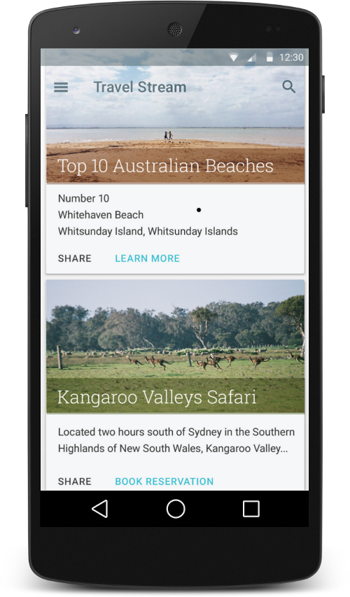
CardView should be used when displaying heterogeneous content (where different cards show different types of information). Using a list or a grid of tiles (non-cards) for homogeneous content is preferred since the boundaries in a card can distract the user from quickly scanning a list.
Using CardView
Lets assume your layout looks something like this:
<FrameLayout
    xmlns:app="http://schemas.android.com/apk/res-auto"
    xmlns:android="http://schemas.android.com/apk/res/android"
    android:layout_width="match_parent"
    android:layout_height="wrap_content">

    <!-- Main Content View -->
    <RelativeLayout>
        ...
    </RelativeLayout>
</FrameLayout>
To create a card using this layout, first you need to import the CardView from AndroidX library in your build.gradle file.
dependencies {

    implementation "androidx.cardview:cardview:1.0.0"

}
Now replace the FrameLayout with CardView.
<androidx.cardview.widget.CardView
    xmlns:card_view="http://schemas.android.com/apk/res-auto"
    xmlns:android="http://schemas.android.com/apk/res/android"
    android:layout_width="match_parent"
    android:layout_height="wrap_content">

    <!-- Main Content View -->
    <androidx.constraintlayout.widget.ConstraintLayout>
        ...
    </androidx.constraintlayout.widget.ConstraintLayout>
</androidx.cardview.widget.CardView>
Customizing CardView
CardView provides a default elevation and corner radius so that cards have a consistent appearance across the platforms. However, you may choose to customize these values if you desire to do so. We can also set the background color of the card.
<androidx.cardview.widget.CardView
    xmlns:card_view="http://schemas.android.com/apk/res-auto"
    xmlns:android="http://schemas.android.com/apk/res/android"
    android:layout_width="match_parent"
    android:layout_height="wrap_content"
    card_view:cardBackgroundColor="#E6E6E6"
    card_view:cardCornerRadius="8dp"
    card_view:cardElevation="8dp">

    <!-- Main Content View -->
    <androidx.constraintlayout.widget.ConstraintLayout>
        ...
    </androidx.constraintlayout.widget.ConstraintLayout>
</androidx.cardview.widget.CardView>
Note that the card_view:cardElevation is used to determine the size and softness of the shadow so as to realistically depict the depth. These properties can be set programmatically as well:
CardView card = ...
card.setCardBackgroundColor(Color.parseColor("#E6E6E6"));
card.setMaxCardElevation(0.0f);
card.setRadius(5.0f);
See the CardView docs for additional properties.
Adding Ripple Effect
By default, a CardView is not tappable and it doesn’t show any touch feedback. Touch feedback animations provide users with visual feedback when a CardView is touched. To enable this behavior, add the following attributes to your CardView.
<androidx.cardview.widget.CardView
  ...
  android:clickable="true"
  android:foreground="?android:attr/selectableItemBackground">
  ...
</androidx.cardview.widget.CardView>
Using the android:foreground="?android:attr/selectableItemBackground" property on a CardView enables the ripple effect to originate from the touch origin.
Support on Older Platforms
On platforms before Android L, CardView adds padding to support corner radius, since rounded corner clipping can be an expensive operation. Similarly, for shadows, before L, CardView adds content padding and draws shadows to that area. This content padding is based on the elevation, and as per the docs:
This padding amount is equal to maxCardElevation + (1 - cos45) * cornerRadius on the sides and maxCardElevation * 1.5 + (1 - cos45) * cornerRadius on top and bottom.
Thus, if you would like to specify custom padding on the content, you need to use a new attribute
card_view:contentPadding.
Similarly, to change the background color of a CardView, you need to use a new attribute
card_view:cardBackgroundColor.