ActionBar Tabs with Fragments
Fragments and Tabs
There are several ways to setup tabs with fragments. The easiest is using ActionBar tabs. Note: Standard ActionBar tabs are not supported in Gingerbread, so many people use ActionBarSherlock when Gingerbread must be supported. Google has also released a support AppCompatActivity class which can be used for compatible tabs. Thankfully, both the support approaches are more or less identical in code with a few class name tweaks.
Note: As of Android 5.0, ActionBar Tabs is now officially deprecated. Tabs should now be built using the TabLayout.
Without Gingerbread Support
To setup tabs using ActionBar and fragments that are not gingerbread compatible, you need to add a TabListener implementation to your application which defines the behavior of a tab when activated. A good default implementation is just adding this to FragmentTabListener.java
Once you have created the FragmentTabListener from this snippet within your app, setup the ActionBar and define which tabs you would like to display and attach listeners for each tab:
public class MainActivity extends FragmentActivity {

	@Override
	protected void onCreate(Bundle savedInstanceState) {
		super.onCreate(savedInstanceState);
		setContentView(R.layout.activity_main);
		setupTabs();
	}

	private void setupTabs() {
		ActionBar actionBar = getActionBar();
		actionBar.setNavigationMode(ActionBar.NAVIGATION_MODE_TABS);
		actionBar.setDisplayShowTitleEnabled(true);

		Tab tab1 = actionBar
			.newTab()
			.setText("First")
			.setIcon(R.drawable.ic_home)
			.setTabListener(
				new FragmentTabListener<FirstFragment>(R.id.flContainer, this, "first",
								FirstFragment.class));

		actionBar.addTab(tab1);
		actionBar.selectTab(tab1);

		Tab tab2 = actionBar
			.newTab()
			.setText("Second")
			.setIcon(R.drawable.ic_mentions)
			.setTabListener(
			    new FragmentTabListener<SecondFragment>(R.id.flContainer, this, "second",
								SecondFragment.class));

		actionBar.addTab(tab2);
	}
}
Now you have fragments that work for any Android version above 3.0. If you need gingerbread support, check out the approaches below.
With AppCompatActivity Support
Google has released an updated support library “android-support-v7-appcompat” which includes official support for the ActionBar with Gingerbread compatibility. To use this, first, we need to upgrade to latest support library by opening the Android SDK Manager and verifying we have the latest “Android Support Library”.
Now, we need to import the support library as a library project following the usual steps. File => Import => Existing Android Code... and then go to your sdk folder and select sdk => extras => android => support => v7 => appcompat.
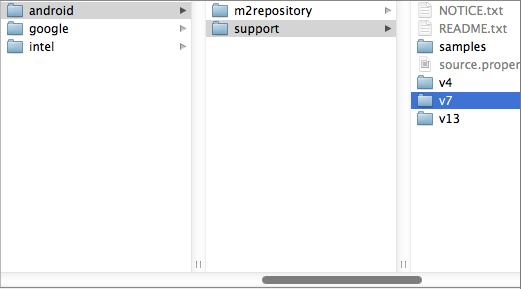
Now, for your app, right-click and select “Properties…” and then add “android-support-v7-appcompat” as a library.

Make sure to setup your app to use the correct support theme within the AndroidManifest.xml:
<?xml version="1.0" encoding="utf-8"?>
<manifest xmlns:android="http://schemas.android.com/apk/res/android"
    package="com.codepath.apps.codepathbootcampapp"
    ...>
    <application
        android:theme="@style/Theme.Base.AppCompat.Light.DarkActionBar"
        ...>
</manifest>
For these compatibility items, you also need to be careful to change the menu items to use a custom prefix in res/menu/example.xml for the showAsAction instead of android:showAsAction:
<?xml version="1.0" encoding="utf-8"?>
<menu
  xmlns:android="http://schemas.android.com/apk/res/android"
  xmlns:myapp="http://schemas.android.com/apk/res-auto">
    <item android:id="@+id/item_menu_ok"
          android:icon="@drawable/ic_action_ok"
          android:title="@string/ok"
          myapp:showAsAction="ifRoom"></item>
    <item android:id="@+id/item_menu_cancel"
          android:icon="@drawable/ic_action_cancel"
          android:title="@string/cancel"
          myapp:showAsAction="ifRoom"></item>
</menu>
To setup tabs using ActionBar and fragments, you need to add a TabListener implementation to your application which defines the behavior of a tab when activated. A good default implementation is just adding this to SupportFragmentTabListener.java.
Once you have created the SupportFragmentTabListener from this snippet within your app, setup the ActionBar and define which tabs you would like to display and attach listeners for each tab:
public class MainActivity extends AppCompatActivity {

	@Override
	protected void onCreate(Bundle savedInstanceState) {
		super.onCreate(savedInstanceState);
		setContentView(R.layout.activity_main);
		setupTabs();
	}

	private void setupTabs() {
		ActionBar actionBar = getSupportActionBar();
		actionBar.setNavigationMode(ActionBar.NAVIGATION_MODE_TABS);
		actionBar.setDisplayShowTitleEnabled(true);

		Tab tab1 = actionBar
		    .newTab()
		    .setText("First")
		    .setIcon(R.drawable.ic_home)
		    .setTabListener(new SupportFragmentTabListener<FirstFragment>(R.id.flContainer, this,
                        "first", FirstFragment.class));

		actionBar.addTab(tab1);
		actionBar.selectTab(tab1);

		Tab tab2 = actionBar
		    .newTab()
		    .setText("Second")
		    .setIcon(R.drawable.ic_mentions)
		    .setTabListener(new SupportFragmentTabListener<SecondFragment>(R.id.flContainer, this,
                        "second", SecondFragment.class));
		actionBar.addTab(tab2);
	}

}
With ActionBarSherlock
Using ActionBarSherlock, the code looks almost exactly the same but automatically supports gingerbread and below. First you must download ActionBarSherlock.zip. Import the code into Eclipse and mark the project as a library. Next, add the library to your application. Watch the video on the FAQ page for a detailed guide.
With ActionBarSherlock installed and added to your app, add the gist code as the SherlockTabListener within your application.
Once you have created the SherlockTabListener from this snippet within your app, setup the ActionBar and define which tabs you would like to display and attaches listeners for each tab:
public class ActionBarSherlockActivity extends SherlockFragmentActivity {

	@Override
	protected void onCreate(Bundle savedInstanceState) {
		super.onCreate(savedInstanceState);
		setContentView(R.layout.activity_action_bar_sherlock);
		setupTabs();
	}

	private void setupTabs() {
		ActionBar actionBar = getSupportActionBar();
		actionBar.setNavigationMode(ActionBar.NAVIGATION_MODE_TABS);
		actionBar.setDisplayShowHomeEnabled(true);
		actionBar.setDisplayShowTitleEnabled(true);

		Tab tabFirst = actionBar
			.newTab()
			.setText("First")
			.setIcon(R.drawable.ic_launcher)
			.setTabListener(
				new SherlockTabListener<FirstFragment>(R.id.flContainer, this, "First",
								FirstFragment.class));

		actionBar.addTab(tabFirst);
		actionBar.selectTab(tabFirst);

		Tab tabSecond = actionBar
			.newTab()
			.setText("Second")
			.setIcon(R.drawable.ic_launcher)
			.setTabListener(
				new SherlockTabListener<SecondFragment>(R.id.flContainer, this, "Second",
							SecondFragment.class));

		actionBar.addTab(tabSecond);
	}
}
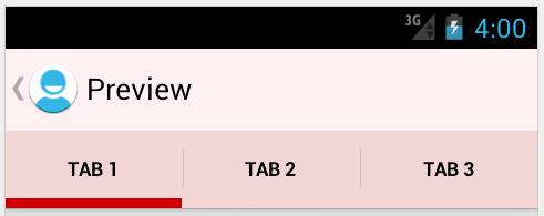
With this approach you can have easy tab navigation switching quickly between fragments.
Reference a Fragment in the Activity
If you need to reference a fragment instance from within the activity, you can refer to the fragment by it’s “tag”. For example, if you created the following tab:
private final String FIRST_TAB_TAG = "first";
Tab tab1 = actionBar
  ...
  .setTabListener(new FragmentTabListener<FirstFragment>(R.id.flContainer, this,
      FIRST_TAB_TAG, FirstFragment.class));
You have assigned the tag FIRST_TAB_TAG to that fragment during construction and you can access the fragment for this tab later using findFragmentByTag:
FirstFragment fragmentFirst = getSupportFragmentManager().findFragmentByTag(FIRST_TAB_TAG);
This will return the fragment instance embedded for that tab.
Communicating Arguments to Fragment
In certain cases we need to be able to pass arguments into the tab fragments during their construction. Fortunately, the FragmentTabListener can accept an optional Bundle argument which will be passed into the fragment automatically during creation:
// Construct the bundle passing in arguments
Bundle firstBundle = new Bundle();
args.putInt("someInt", someInt);
args.putString("someTitle", someTitle);
// Pass bundle into the tab listener constructor
Tab tab1 = actionBar
  ...
  .setTabListener(new FragmentTabListener<FirstFragment>(
      R.id.flContainer, this, "First", FirstFragment.class,
      firstBundle)); // <-- Bundle passed here
Then within the FirstFragment we can access these arguments with getArguments:
public class FirstFragment extends Fragment {
   @Override
   public void onCreate(Bundle savedInstanceState) {
       super.onCreate(savedInstanceState);
       // Get back arguments
       int SomeInt = getArguments().getInt("someInt", 0);
       String someTitle = getArguments().getString("someTitle", "");
   }
}
Tab Selection
Once the ActionBar has been set to ActionBar.NAVIGATION_MODE_TABS navigation mode, we can look at the currently selected tab index with getSelectedNavigationIndex():
// Returns tab index currently selected
getSupportActionBar().getSelectedNavigationIndex();
We can set the currently selected tab by index with setSelectedNavigationItem:
// sets current tab by index to the first tab on the bar
getSupportActionBar().setSelectedNavigationItem(0);
We can also access arbitrary tabs, check the number of tabs or remove them:
// returns the tab object at position 0
getSupportActionBar().getTabAt(0);
// returns the total number of tabs
getSupportActionBar().getTabCount();
// Removes the first tab
getSupportActionBar().removeTabAt(0);
// Returns the currently selected tab object
getSupportActionBar().getSelectedTab();
// Select a tab given the tab object
getSupportActionBar().selectTab(someTabObject);
Using these methods described above, we can modify the tabs and their selected states at runtime.
Note: Occasionally, you might attempt to switch the current tab and load a fragment in the wrong event (for example onActivityResult) and encounter an error such as IllegalStateException: cannot perform this action after onSaveInstanceState. This is typically tied to replacing fragments onto the content pane at a time where state loss could occur. Read this article for a detailed description of the issue. See this solution for one common approach to solving this.
Styling Tabs
There are several different ways of styling the tabs within the ActionBar. The easiest way to style the ActionBar tabs is using the nifty Android ActionBar Style Generator. This utility will allow you to easily drop-in a new skin for the ActionBar.
Custom Styles
Doing custom styling of the ActionBar requires using the Styles system for declaring the look of the ActionBar and tabs more manually by setting various tab related styles and themes. There are actually a few related styles for different sections of the ActionBar Tabs:
actionBarTabBarStyle– This determines the style of the overall tab bar which contains the tabs.actionBarTabStyle– This determines the style of the individual tabs themselves including the indicator.actionBarTabTextStyle- This determines the style of the tab text.
We can tweak the styles of these by building a custom theme in the res/values-v14/styles.xml:
<style name="MyTheme" parent="@android:style/Theme.Holo.Light">
    <item name="android:actionBarTabBarStyle">@style/MyTheme.ActionBar.TabBar</item>
    <item name="android:actionBarTabStyle">@style/MyTheme.ActionBar.TabView</item>
    <item name="android:actionBarTabTextStyle">@style/MyTheme.ActionBar.TabText</item>
</style>

<style name="MyTheme.ActionBar.TabBar" parent="android:style/Widget.Holo.Light.ActionBar.TabBar">
    <!-- This is an ORANGE background -->
    <item name="android:background">@drawable/tab_bar_background</item>
</style>

<style name="MyTheme.ActionBar.TabView" parent="android:style/Widget.Holo.ActionBar.TabView">
    <!-- This is a GREEN background -->
    <item name="android:background">@drawable/tab_view_background</item>
</style>

<style name="MyTheme.ActionBar.TabText" parent="android:style/Widget.Holo.ActionBar.TabText">
    <!-- This is a WHITE tab color -->
    <item name="android:textColor">@android:color/white</item>
</style>
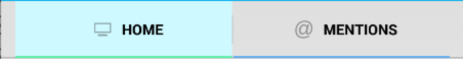
The result of these styles is this with the actionBarTabBarStyle set orange, the actionBarTabStyle set green and the actionBarTabTextStyle set purple (selected) or white:

Customize Tabs with Indicator Colors
To customize the tabs including bottom indicators, we will be overriding actionBarTabStyle which determines the style of the tabs themselves. The tab is the area that includes the text, its background, and the little indicator colored bar under the text. If you want to customize the indicator, you need to alter this style.
First, we need to create the tab_bar_background drawable which defines the tab drawables for each state. This will be a selector drawable, which has different layer-lists applied depending on whether the tab is selected or not. In res/drawable/tab_bar_background.xml we can add:
<?xml version="1.0" encoding="utf-8"?>
<selector xmlns:android="http://schemas.android.com/apk/res/android">
  <!-- UNSELECTED TAB STATE -->
  <item android:state_selected="false" android:state_pressed="false">
      <layer-list xmlns:android="http://schemas.android.com/apk/res/android">
        <!-- Bottom indicator color for the UNSELECTED tab state -->
        <item android:top="-5dp" android:left="-5dp" android:right="-5dp">
             <shape android:shape="rectangle">
                 <stroke android:color="#65acee" android:width="2dp"/>
             </shape>
        </item>
      </layer-list>
  </item>
  <!-- SELECTED TAB STATE -->
  <item android:state_selected="true" android:state_pressed="false">
    <layer-list xmlns:android="http://schemas.android.com/apk/res/android">
       <!-- Tab background color for the SELECTED tab state -->
       <item>
          <shape>
              <solid android:color="#cef9ff"/>
          </shape>
       </item>
       <!-- Bottom indicator color for the SELECTED tab state -->
       <item android:top="-5dp" android:left="-5dp" android:right="-5dp">
           <shape android:shape="rectangle">
               <stroke android:color="#5beea6" android:width="2dp"/>
           </shape>
       </item>
    </layer-list>
  </item>
</selector>
Each state applies a different layer-list representing the different tab states. The indicator under the active tab comes from the background drawable. To draw the indicator, we created a layer-list for a rectangle shape with a 2dp stroke around the exterior, then offset the rectangle so that the top, left and right sides are outside the bounds of the view, so we will only see the bottom line.
Finally, we need to set the background for the tabs to the tab_bar_background drawable in res/values-v14/styles.xml:
<style name="MyTheme" parent="android:Theme.Holo.Light">
    <item name="android:actionBarTabStyle">@style/MyTheme.ActionBar.TabView</item>
</style>

<style name="MyTheme.ActionBar.TabView" parent="android:style/Widget.Holo.ActionBar.TabView">
    <item name="android:background">@drawable/tab_bar_background</item>
</style>
With these steps in place, we now have fully customized tabs with this result:
Setting Tab Text Color
We may also want to customize the tab text color based on the selected state of the tab. This allows the tab to be one color when selected and another color when unselected. To do this, we need to define a color selector in res/color/selector_tab_text.xml:
<?xml version="1.0" encoding="utf-8"?>
<selector xmlns:android="http://schemas.android.com/apk/res/android">
    <!-- SELECTED COLOR -->
    <item android:state_selected="true"
        android:color="#6e62ff"/>
    <!-- UNSELECTED COLOR -->
    <item android:state_selected="false"
        android:color="#f8fff4"/>
</selector>
and then we can apply this color selector to the tab text color within res/values/styles.xml:
<style name="MyTheme" parent="@android:style/Theme.Holo.Light">
    <item name="android:actionBarTabTextStyle">@style/MyTheme.ActionBar.TabText</item>
</style>

<style name="MyTheme.ActionBar.TabText" parent="android:style/Widget.Holo.ActionBar.TabText">
    <!-- This is a PURPLE text color when selected and a WHITE color otherwise -->
    <item name="android:textColor">@color/selector_tab_text</item>
</style>
The result of these styles is that the text color is purple when tab is selected and white otherwise.

Additional Examples
Browse the Styling the ActionBar official guide for a basic overview. If you are serious about wrestling tabs styles into submission though, check out these resources as well:
- Check out this article for a detailed look at styling tabs in the action bar
- This second article details how to style tabs as well with several examples.
- You can supply a custom view for each tab in truly custom cases that radically changes the look and feel of the tab.
- Consider replacing tabs with the ViewPager and using a third-party tab indicator which more easily achieves the desired effect.
Note that fully customizing tabs requires an understanding of Drawables as well.
Styling Tabs with ActionBarSherlock
If you are using ActionBarSherlock, you will need to do the following to custom style your tabs:
Change background color of tab container:
You will need to customize android:actionBarTabBarStyle in order to achieve this. actionBarTabBarStyle determines the style of the overall tab bar. It includes the whole container that includes all of the tabs.
- Create style for “Widget.Sherlock.Light.ActionBar.TabView” in
res/values-v14/styles.xml. - Reference this style for “actionBarTabBarStyle”.
In res/values/styles.xml:
<style name="AppBaseTheme" parent="android:Theme.Holo.Light.DarkActionBar">
        <!-- API 14 theme customizations can go here. -->
        <item name="android:actionBarTabBarStyle">@style/ActionBarTabStyle</item>
        <item name="actionBarTabBarStyle">@style/ActionBarTabStyle</item>
</style>

<style name="ActionBarTabStyle" parent="Widget.Sherlock.Light.ActionBar.TabView">
    <item name="android:background">@color/white</item>
</style>
Format ActionBarSherlock Tab Text
Customize “android:actionBarTabBarStyle” in res/values-v14/styles.xml as follows:
<style name="AppBaseTheme" parent="android:Theme.Holo.Light.DarkActionBar">
    <!-- API 14 theme customizations can go here. -->
    ...
    <item name="android:actionBarTabTextStyle">@style/ActionBarTabTextStyle</item>
    <item name="actionBarTabTextStyle">@style/ActionBarTabTextStyle</item>
</style>

<style name="ActionBarTabTextStyle" parent="Widget.Sherlock.ActionBar.TabText">
    <item name="android:textColor">@color/actionbar_color_selector</item>
    <item name="android:fontFamily">sans-serif-light</item>
    <item name="android:textSize">16sp</item>
    <item name="android:textAllCaps">false</item>
</style>
To define a selector to choose different text color based on tab state, create res/color/actionbar_color_selector.xml:
<?xml version="1.0" encoding="utf-8"?>
<selector xmlns:android="http://schemas.android.com/apk/res/android">
    <item android:state_selected="true" android:color="@color/red" />
    <item android:color="@color/black" />
</selector>
Sometimes its required to change the text typeface depending on the tab state. e.g. You might want to change the text typeface to bold for the selected tab. We can achieve this in the ‘onTabSelected’ and ‘onTabUnselected’ methods in ‘SherlockTabListener.java’ class.
public void onTabSelected(Tab tab, FragmentTransaction ft) {
    ...
	String formattedName = "<b>" + tab.getText() + "</b>";
	tab.setText(Html.fromHtml(formattedName));
}

public void onTabUnselected(Tab tab, FragmentTransaction ft) {
	if (mFragment != null) {
		String formattedName = tab.getText().toString();
		tab.setText(Html.fromHtml(formattedName));
		// Detach the fragment, because another one is being attached
		ft.detach(mFragment);
	}
}
Format ActionBarSherlock Indicator
Override ‘actionBarTabStyle’ - it determines the style of the tabs themselves. The tab is the area that includes the text, its background, and the little indicator bar under the text. If you want to customize the indicator, you need to alter this one.
- Create the tab_bar_background drawable. This will be a state list drawable, which has different visual appearance depending on whether the tab is selected and/or pressed. In the state list, we’ll reference two other drawables for when the button is selected, and we’ll just use a plain color for the unselected states.
In res/drawable/tab_bar_background.xml:
<?xml version="1.0" encoding="utf-8"?>

<selector xmlns:android="http://schemas.android.com/apk/res/android">
  <item android:state_focused="false" android:state_selected="false" android:state_pressed="false" android:drawable="@color/transparent"/>
  <item android:state_focused="false" android:state_selected="true" android:state_pressed="false" android:drawable="@drawable/tab_bar_background_selected"/>
  <item android:state_selected="false" android:state_pressed="true" android:drawable="@color/tab_highlight"/>
  <item android:state_selected="true" android:state_pressed="true" android:drawable="@drawable/tab_bar_background_selected_pressed"/>
</selector>
- We’ll also need to create a colors.xml file to define the two colors we used in the state list drawable:.
In res/values/colors.xml:
<?xml version="1.0" encoding="utf-8"?>
<resources>
    <color name="transparent">#000000</color>
    <color name="tab_highlight">#65acee</color>
</resources>
- Now, we need to create the drawables for the different backgrounds. The indicator under the active tab comes from the background drawable, so in our custom version, we’ll include an indicator in the proper color. To do this, I used a hack where I create a layer list with a rectangle shape with a 2dp stroke around the exterior, then offset the rectangle so that the top, left and right sides are outside the bounds of the view, so you only see the bottom line. In the case of the “pressed” version, the fill color is set on the rectangle to indicate that it is pressed.
In res/drawable/tab_bar_background_selected.xml:
<?xml version="1.0" encoding="utf-8"?>

<layer-list xmlns:android="http://schemas.android.com/apk/res/android">
    <item android:top="-5dp" android:left="-5dp" android:right="-5dp">
        <shape android:shape="rectangle">
            <stroke android:color="#65acee" android:width="2dp"/>
        </shape>
    </item>
</layer-list>
In res/drawable/tab_bar_background_selected_pressed.xml:
<?xml version="1.0" encoding="utf-8"?>

<layer-list xmlns:android="http://schemas.android.com/apk/res/android">
    <item android:top="-5dp" android:left="-5dp" android:right="-5dp">
        <shape android:shape="rectangle">
            <stroke android:color="#65acee" android:width="2dp"/>
        </shape>
    </item>
</layer-list>
- Finally, we need to set the background for the tabs to the “tab_bar_background” drawable in
res/values-v14/styles.xml:
<style name="AppBaseTheme" parent="android:Theme.Holo.Light.DarkActionBar">

    <!-- API 14 theme customizations can go here. -->
    ...
    <item name="android:actionBarTabStyle">@style/Widget.Sherlock.Light.ActionBar.Tab</item>
    <item name="actionBarTabStyle">@style/Widget.Sherlock.Light.ActionBar.Tab</item>
</style>

<style name="Widget.Sherlock.Light.ActionBar.Tab">
    <item name="android:background">@drawable/tab_bar_background</item>
</style>
With those steps, you now have fully customized tabs!